a teeny-tiny home improvement project January 22, 2009
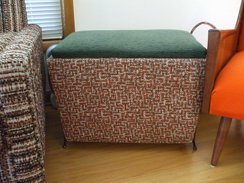
I have been looking for a non-princess/sports/ugly toy box for Pearl’s room for awhile (my dream is to find the alphabet chalkboard-sliding door one from my childhood, but no luck so far) and craigslist and eBay hadn’t turned up any good leads. So last week when Caitlin and I went by Village Merchants, I spotted this padded bench/chest thing (on sale, even) and it seemed like a good start to my toy box mission!
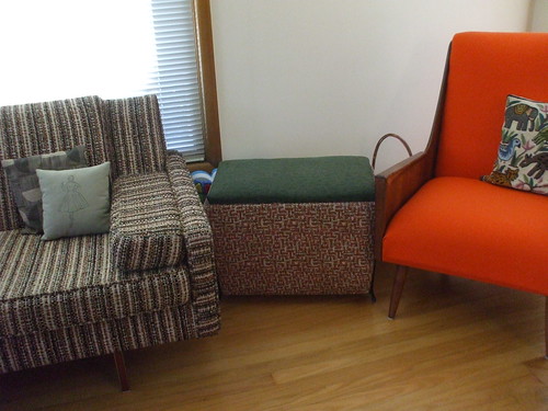
I was originally thinking of pulling off some decoupaged and fabric-ed craftiness in good Pearl-like colors, but then I realized that the biggest toy black hole in our house is actually the living room, where we spend a bunch of time together. Her stuff ends up everywhere and I’m not crazy about 1) seeing and stepping over all of it all the time and 2) hunting for her favorite thing which is inevitably lost under the couch or behind the record cabinet. Our house was built in 1950 and we love modern furniture, so the boomerang/atomic-style pattern seemed to work with the rest of our stuff,
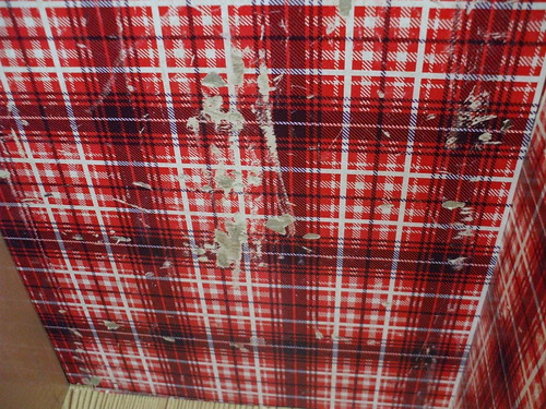
but the inside was really crying out for help. If you have hung out with a baby much, you know that anything that can go in the mouth will go in the mouth, and the prospect of this grimy beaten-up interior
brushing up against all the toys and books that she gnaws on was pretty off-putting.
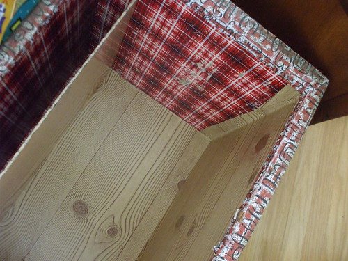
So, one super-scrubbing later, I picked up a roll of woodgrain contact paper at Fred Meyer and started re-papering the inside! It was amazingly easy. I just measured the inside bottom piece and added a panel right over the old junky layer,
added diagonal strips at the corners, and filled it in with panels from side to side on each wall, and an extra strip all around the top.
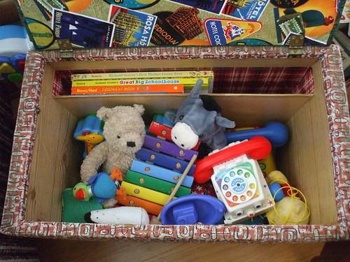
It holds a bunch of her toys and even looks like something grown-up when it’s closed!
Anyway, I’m pretty embarrassed to write up a whole post raving about contact paper like it’s some brand-new revelation, but it really brought this thing back to life. The last time I remember using “shelf paper” was at my parents’ house — it was a geometric pattern in the aggressive 80s primary colors I do my best to avoid now, so it was cool to find a simple woodgrain print that was totally me and mixed with the atomic-style stuff so easily.
Now I have almost an entire roll left for the next thing that needs stylish papering over! This stuff is so addictive.




Leave a Reply